Do you know
How much is 1 Big Mac
in 2004...


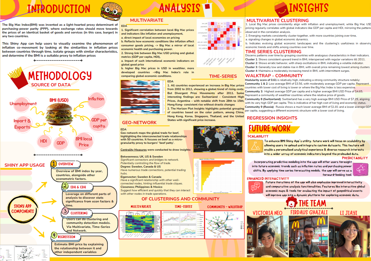
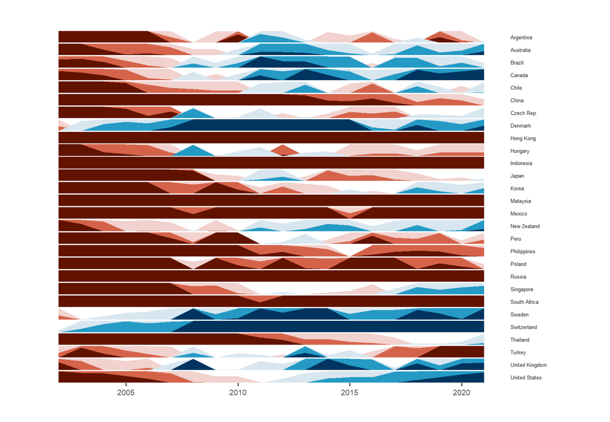
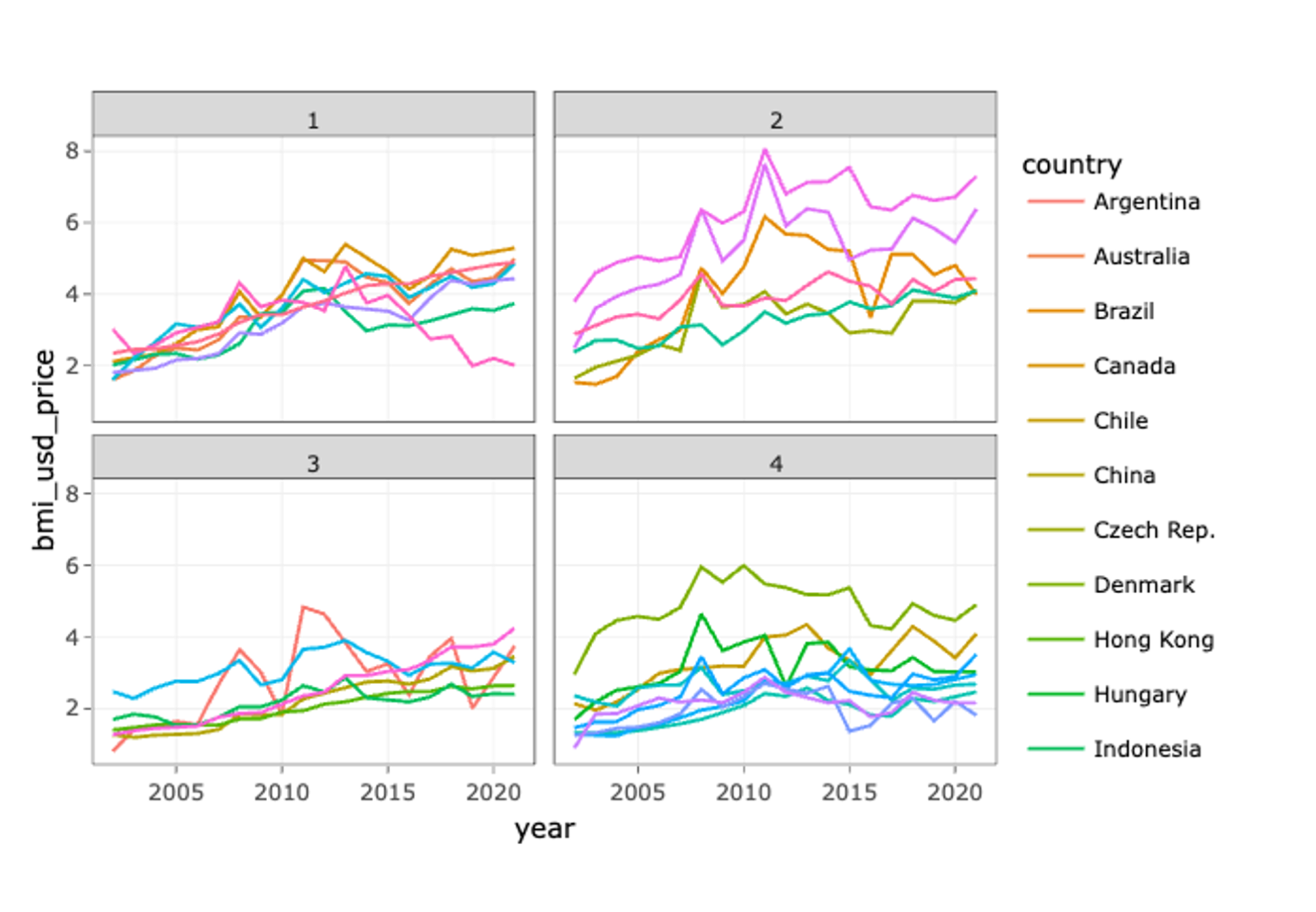
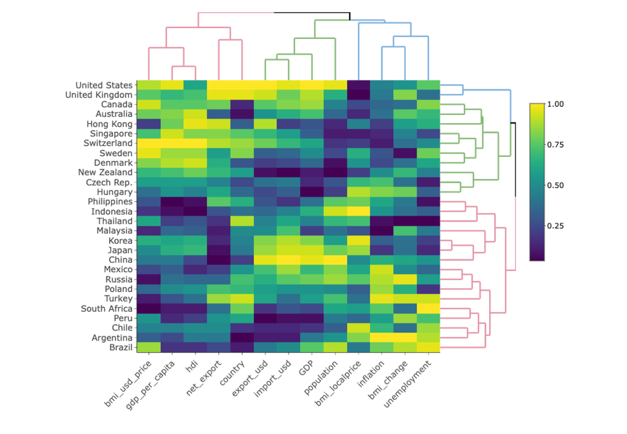
Welcome to the 🍔 Big Mac Index adventure, a tasty dive into 📈 global economics through the price of a burger! From 🇸🇬 Singapore's price leap from SGD 3.3 in 2001 to SGD 5.9 in 2021, to the stark contrasts between 🇷🇺 Russia's $1.8 and 🇨🇭 Switzerland's $7.3, every price has a story. Navigate the economics of our world with an interactive dash, blending numbers with a sprinkle of analysis. 🧐 Embark on a journey where currency tales are as appetizing as the burgers themselves. Ready for a bite into the economics that shape our 🌎 globe?
Find Out MoreStep 1
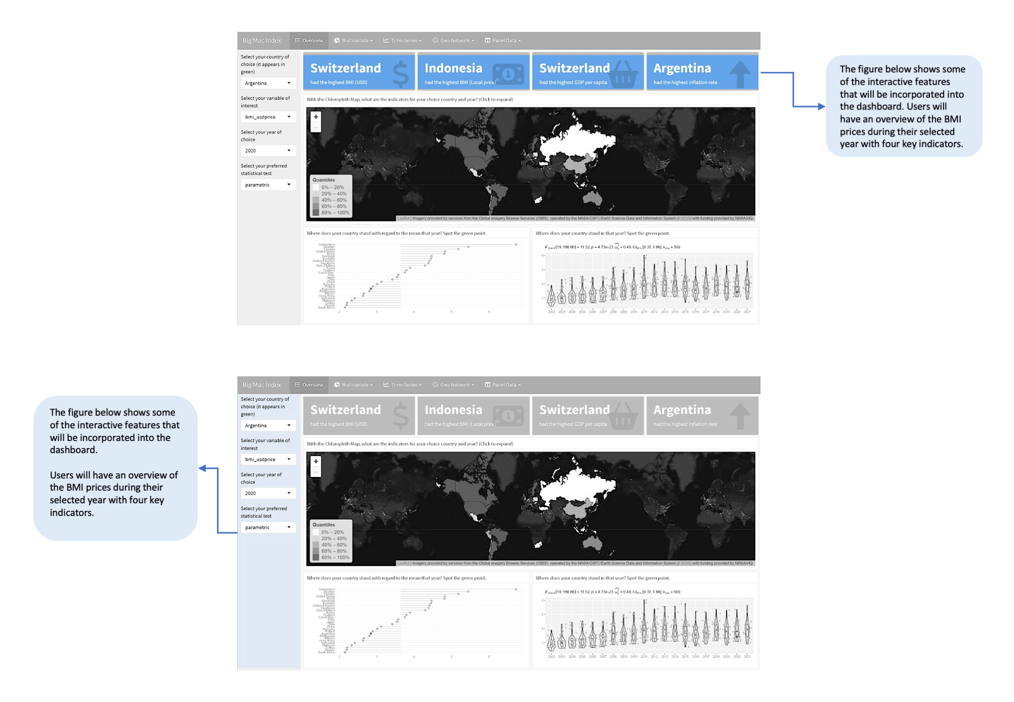
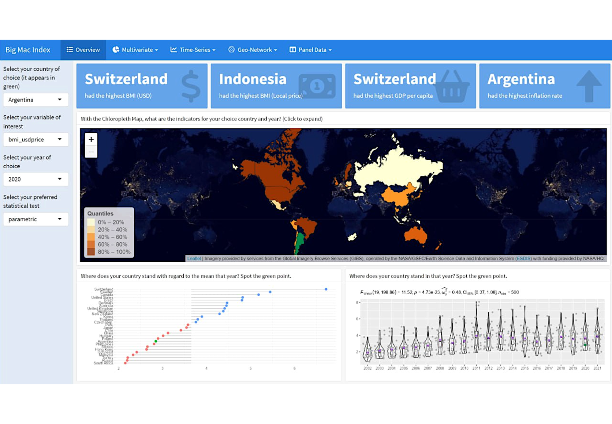
Explore, discovery pattern and insights
Step 2
Confirm patterns and test insights
Step 3
Map data relationships and predict trends
Step 4
Visualize data, interact, and get insights instantly

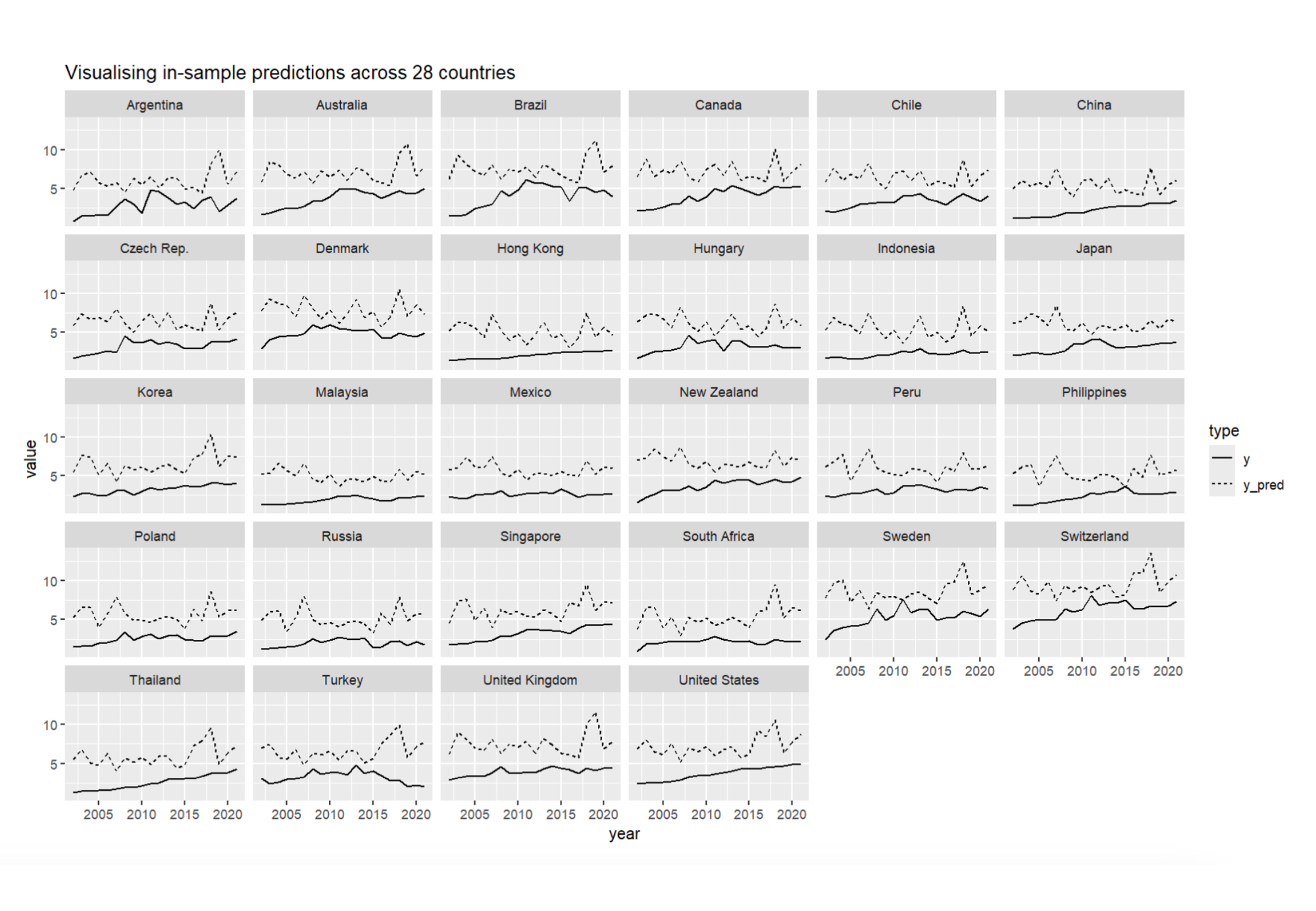
Our app democratizes data analysis by offering an intuitive user interface that requires no coding expertise. Users can effortlessly perform exploratory (EDA) and confirmatory data analysis (CDA), as well as model building, making complex analyses accessible to all.
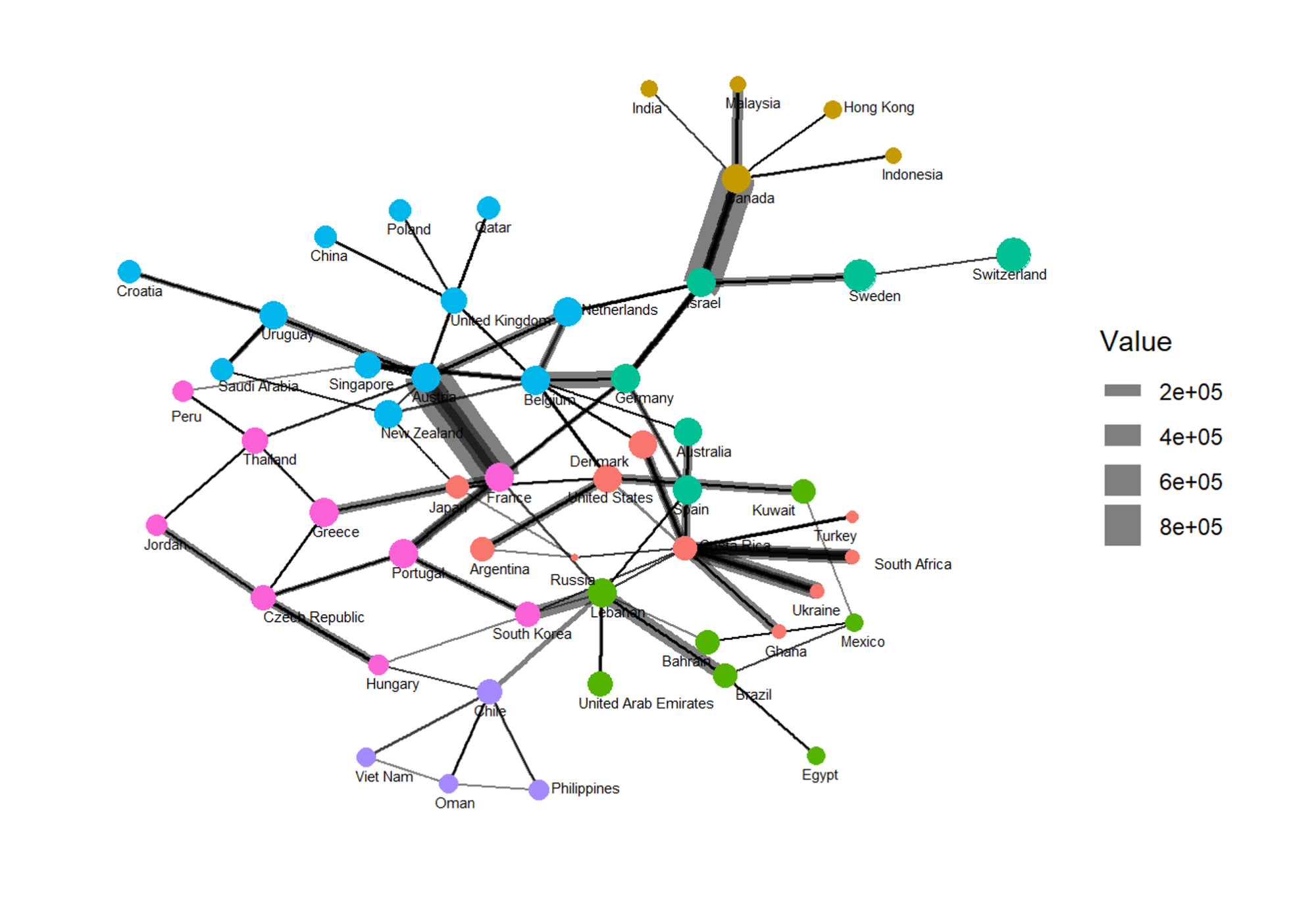
This feature brings your data to life, enabling users to engage with the visualizations through hovering, selecting, and dragging. It fosters a dynamic interaction among different storyboards, enhancing the data exploration experience.
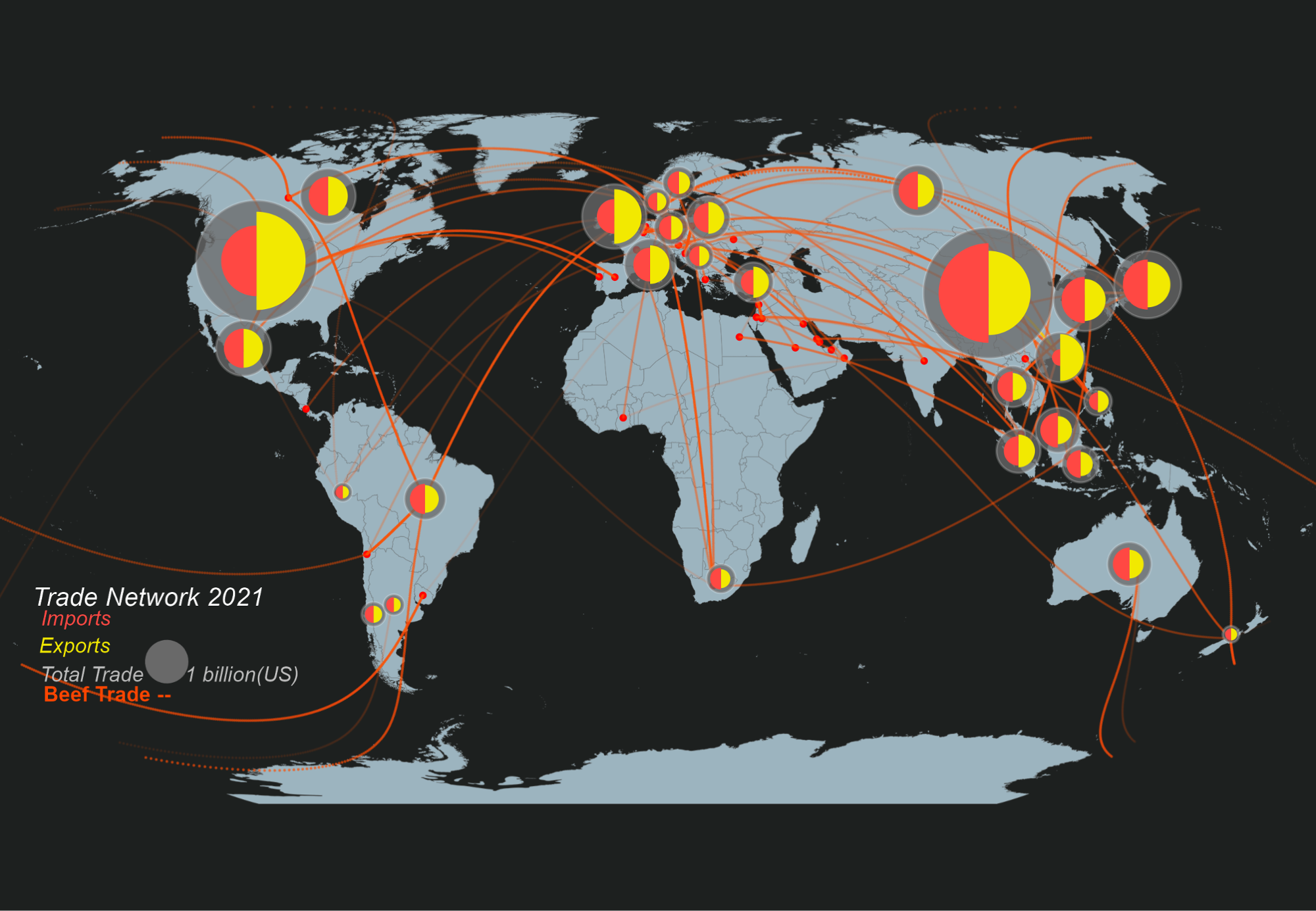
Designed for adaptability, this functionality allows users to analyze geospatial and time series data. It supports scaling and generalization across similar datasets, offering insights into spatial patterns and temporal trends without the need for specialized knowledge.